Capture One, Several Years Later

Capture One Pro, colour editing tools

Capture One Pro, colour editing tools

I was a long time Adobe Lightroom user to catalog and edit my professional as well as personal photography. I used Lightroom right from the first public Beta version and every version since right up to Lightroom Classic CC. I still have it on my computer, and I’ll explain why another time.

CaptureOneEditingTools.png

However, in around 2015, Lightroom was running painfully slow on my aging Mac Pro (early 2008). Edits that should be taking seconds to perform, were taking minutes. It was either time for a new computer, or new software. Apple hadn’t upgraded the Mac Pro recently, and it’s still in the distant future (2019, hopefully), so I looked at software and found Capture One.

I downloaded the trial and installed it. It was so much faster than Lightroom that I thought I found the answer. However, there was a learning curve that seemed quite steep and I found myself returning to Lightroom again and again, frustrated that I couldn’t do what I wanted to in Capture One, simply because I didn’t know how to translate my Lightroom knowledge into Capture One functions.

After several months of bouncing back and forth, Lightroom continued to slow down and became increasingly difficult to use. So I dove whole-heartedly into Capture One. I discovered that it’s not a steep learning curve, but rather a “re-learning” curve. Once I made the conscious effort to forget Lightroom and work within Capture One exclusively, it became much easier. I think anyone starting with Capture One would probably learn it much quicker than I did.

Since then, and now several years later, I work exclusively with Capture One. And now, if I go back to an old catalog in Lightroom, I get frustrated because I find the Capture One workflow to be so much superior.

First off, I can work in Sessions rather than Catalogs. This is great for my professional work; work that is photographed, edited and delivered, and then archived. I don’t need it ‘cataloged’, it’s done! Of course I can always go back to the session, re-edit images, export new variations, or anything else.

Another advantage of Sessions is that they are self-contained within their folder. I can copy the folder of images, including the Capture One Session files and move them to another computer for further editing. No need to export or import catalog images. Very efficient.

I can, and still do use Catalogs for my personal photography, my family photos and even for some recurring clients where a catalog of images simply works better as a workflow. But the great thing is that I have the option to use either method, or both!

However, the best thing about Capture One is the incredible control I have for adjusting tonality and colour. There are so many options to fine tune an image that I’d have to write a book to cover them all. There’s plenty of information on the web for that.

My purpose for writing this though, is to inform photographers that there is life after Adobe! Of course I still use PhotoShop, but less than ever before because of the wonderful tools that Capture One employs to edit an image.

I plan on blogging more on Capture One, and to run seminars on it’s use at my studio. In the meantime, if you’d like to learn more about Capture One, click below!

Photographing A Classic

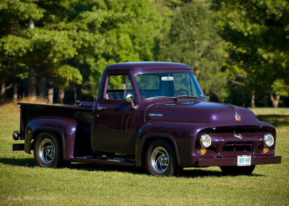
Stan & Bonnie Walker's 1954 Ford F100 Pickup Truck

Pride of Ownership

Sometimes I'm asked to do a portrait, not of a person or a pet, but of someone's "other true love", their car, or in this case, their truck, a 1954 Ford F100 Pickup. The truck belongs to Stan and Bonnie Walker and although I'm sure there's a great story to be told about it's restoration, I wanted to comment on what it's like to photograph a Classic.

I'm not necessarily an automobile enthusiast like some people, but I do appreciate fine craftsmanship, attention to details and a beautiful finish. Something like a fine portrait! None-the-less, when presented with a fine Classic Car like this, you want to create something special. You want to not only capture the beauty of the car, but reveal a little bit of it's 'soul', just like a person.

Detail of hood and fender showing not only the beautiful lines of this Classic, but the incredible finish as well.

Approaching the Subject

I approach this subject very much like I approach photographing a person. We've decided on a location and the best time of day for the portrait session. Through the consultation, I've determined what the client is looking for, what the portrait means to them and have an idea of how they want to display the finished print.  

I look at the subject's features to determine which angles will be most flattering, which angles will highlight the strengths and soften areas not as appealing. Before starting the shoot, we collaborate on the details that are important to the client and I learn a little history at the same time. 

Only after a close inspection do I then choose an appropriate background and position the subject in the best possible light.  I wanted to highlight the incredible depth of colour in this truck so positioned it for a wide range of luminosity from deep blacks to specular highlights. 

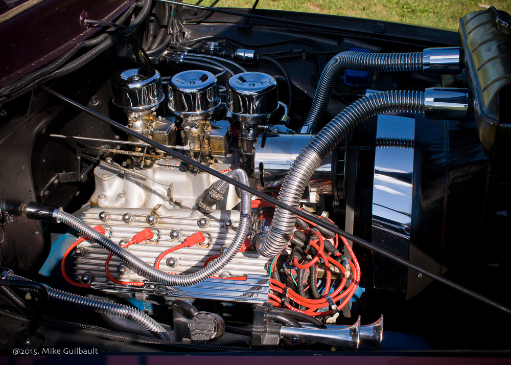
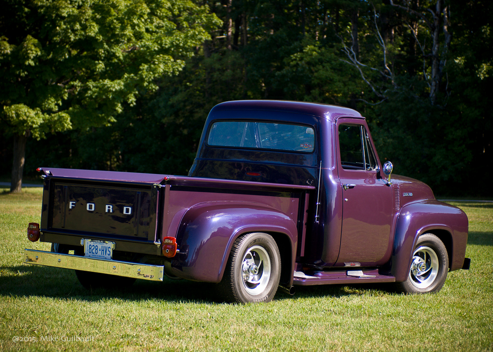
Then the work really begins. I start from further away to show the vehicle within the environment, which is why choosing the best background is so important. I circle the subject photographing from different angles to show not only the face, but the beautiful lines of the truck from the every angle. I slowly move closer, picking features that interest me and closer again to highlight details that may not be noticeable from further away. Following the light is imperative and we move the truck whenever the light changes to make sure I'm always taking advantage of the best possible illumination.

After the photographs were shown to our couple, they couldn't decide on just one image, so we created a collage, using the main image of the truck as the centre piece with some details surrounding it, and a caption. The 30" print is now proudly displayed in their home.

The finished print.

Decorating with Fine Art Portraiture

Printed portraits of your family, whether in one photograph or individually, is not a new way to create wall art, but now more than ever it's an important decision for preserving your heritage and displaying the pride you have in your family. While most photographs today are created digitally and rarely appear in printed form, it's imperative that our generation make the effort to preserve these precious memories. And here is where professional photography makes a difference - creating portraiture that is worthy of a prominent place on your walls. 

Portraits offer a multitude of decorative possibilities. Displayed as a focal point in either the privacy of your home or on the walls of your office, you'll be able to enjoy the closeness of your family without having to turn on an electronic device.  No matter what space you have, portraiture can personalize the decor of any location.

A beautifully framed canvas portrait creates a much more personal focal point to a room than some nondescript mass-produced painting.

Designing with portraiture is easy when you make use of the many creative tools we have to assist you. And when the finished work is on display in your home or office, you find that it serves as both a tasteful reflection of your individualized decorating style as well as a tribute to the ones you love.  Studies have shown that children that grow up in homes that display portraits of family, grow up with a much more secure sense of belonging.

Any art form possesses the capacity to touch our emotions. Professional portraits carry with them an additional dimension of expression that communicates how we feel about ourselves, our world, and those closest to us. Portrait subject matter and settings are limited only by your imagination.  Children as they grow, family events, expressive personal statements are all appropriate for decorative portraiture.

If you have a particularly large space to fill, a "wall collection" may be a great alternative to the single portrait. Wall collections are a grouping of wall portraits that display a variety of images. 

Here are some key points to keep in mind:

  • The portrait's overall colour theme should blend with or compliment the room's colour palette.
  • Keep in mind the decorative intent of the room in which you plan to display your portrait when you consider its style. This will help set the portrait's 'tone' and guide you in selecting appropriate clothing and accessories, and help us to decide on an appropriate location.
  • An appropriately sized portrait is one that dominates the space in which it is hung, but does not appear to be crowding that space.  Consider whether the space lends itself better to a vertical or horizontal composition.
  • You also want the portrait to be of sufficient size as to be able to enjoy it from a distance, rather than having to approach it closely to see the subjects.
  • Framing provides the finishing touch to fine portraiture. Select a frame that compliments the image and accents the room's furnishings, not one that distracts from the subject matter.  Simple is often better.

Whether your portrait is an accessory or the room's focal point, placement is critical. All elements of design; colour, style, composition, and size must work together to complete the decorative statement.

If you would like more information, or would like to arrange a consultation, please call our studio or email us with your request.

Mike Guilbault, MPF